Web Push Notification Opt-In Best Practices: A Practical Guide
Learn web push notification opt in best practices to ask at the right time, write clear copy, and boost subscriptions without interrupting users.
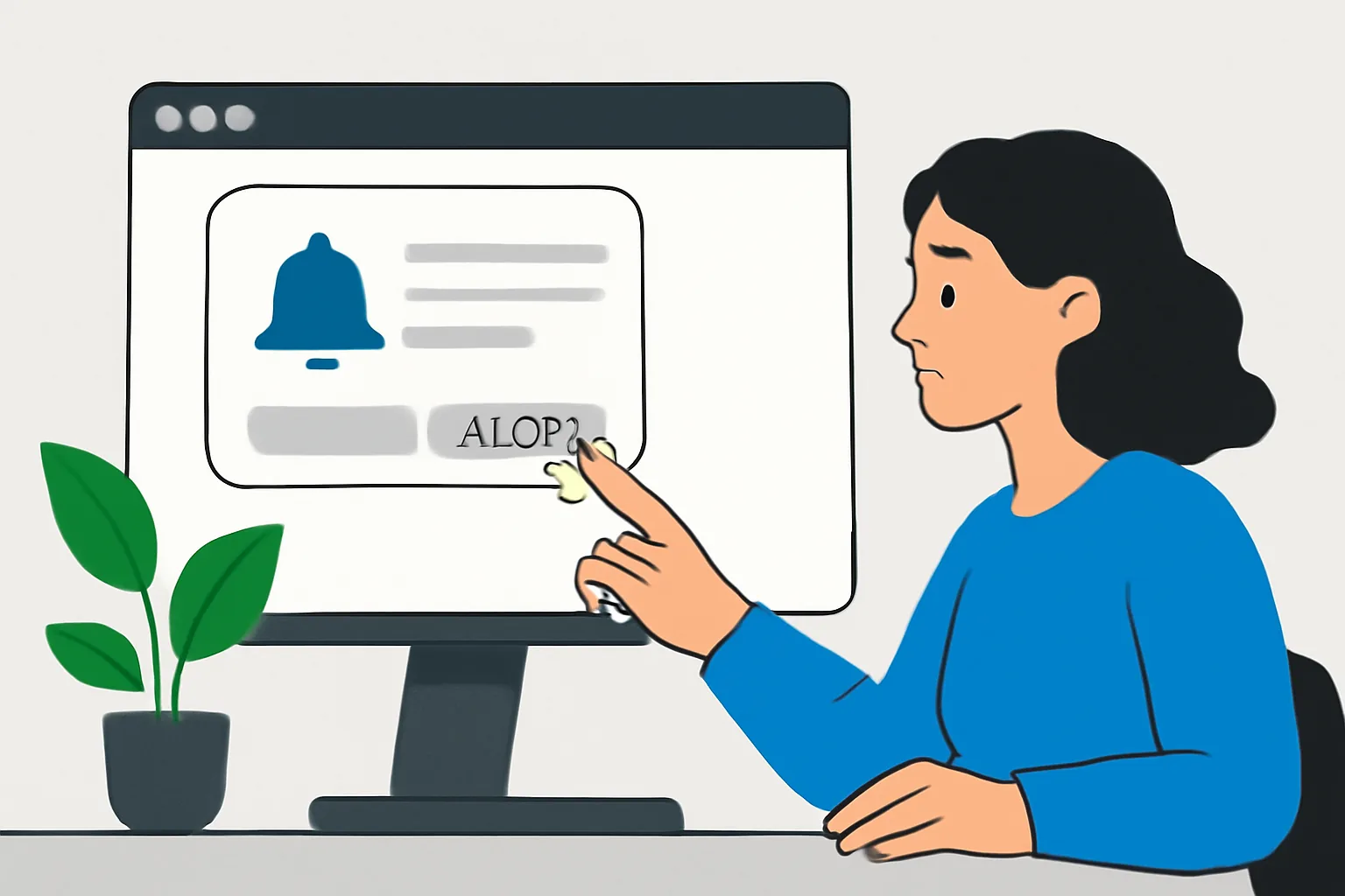
1. What Web Push Opt-In Is and Why It Matters
Web push opt-in is the moment a visitor says yes to browser notifications. That sounds simple, and it is, but the timing and wording decide a lot. A prompt shown on the first page view can feel like a shove. A prompt shown after a real action can feel like a service.
There are only two outcomes that matter here: a subscription or a refusal. The browser permission box itself is usually familiar, yet the request that leads to it is where most teams lose people. If your request feels random, users skip it. If it feels tied to what they just did, acceptance rises.
The practical side is plain. Web push opt-in works best when the user already sees value on the page, and the request simply makes that value easier to keep up with. For a news site, that might mean breaking stories. For a store, it might mean restocks or order updates. For a sports site, it could be score alerts. One prompt, one promise.
Teams that treat web push opt-in like a banner ad tend to get weak lists. Teams that treat it like a small agreement usually do better. If you want a wider reference on the channel itself, see web push notification best practices.
2. Best Times to Ask for Permission
The worst time to ask is the first second. The user has not learned enough yet. You need a cue, and that cue can be a click, a scroll depth, a second page view, or a completed action. Each one gives the user a reason to care.
A recipe site can wait until someone views a second recipe. An ecommerce store can ask after a wishlist save. A travel site can ask after a search for flights or hotels. Those are concrete moments, not guesses. They show intent.
One useful rule: ask after engagement, not before it. If someone spends 45 seconds reading an article or adds an item to cart, the request feels connected to their activity. If someone lands and sees a prompt before the headline, the answer is usually no. Short lesson, loud result.
Ask after value signals too. If the page makes a promise, such as stock alerts, deadline reminders, or breaking news, that promise can support the opt-in request. The user should not have to infer the benefit. You should state it where they can see it. This is where push notification permission timing matters most.
3. How to Write Clear, Value-Focused Permission Copy
Permission copy should answer one question in one glance: why should I allow this? If the answer takes three sentences, the copy is too long. Say the benefit first. Then say what kind of notifications they will get. Then stop.
Good copy sounds specific. “Get back-in-stock alerts for products you viewed” is stronger than “Stay updated.” “Get breaking story alerts from this topic” is stronger than “Receive news.” Clarity matters because the browser prompt itself is already a decision point; vague copy only adds friction.
A small aside: people do not want to feel tricked. If the site says “Get only important updates” and then sends five messages a day, the trust loss is immediate. One false promise can undo 10 polite ones.
Use words the user can check against reality. If the notifications will come once a week, say once a week. If they will cover only one topic, name that topic. This is where web push notification opt in best practices stop being abstract and become visible on the page. These are browser notification copy tips that keep the promise understandable.
For teams already thinking about timing and copy together, the examples in web push notification examples can help, especially if the site has more than 1 content category or audience segment.
4. Designing a Non-Interruptive Opt-In Experience
The request should not hijack the page. A pre-prompt, banner, inline card, or soft modal can prepare the user before the browser permission box appears. That extra step matters because it gives context before the harder decision.
Pre-prompts work best when they are short and reversible. A simple “Want alerts for new deals?” with one clear button can lower pressure. The browser dialog comes next. If the pre-prompt is large, loud, or covers the whole screen on mobile, it starts to feel like a trap.
Placement matters too. Put the request where the user is already looking: near an article end, beside a saved search, below a product filter, or after a checkout milestone. Keep it near the action that makes the subscription useful. A floating box on every page can train people to ignore it.
One common mistake is stacking too many layers. A banner, then a modal, then the browser prompt can make the flow feel like a toll booth. One extra step is often enough. Two at most.
5. Segmentation and Relevance in Opt-In Strategy
Not every visitor wants the same notifications. A sports fan clicking a football page should not receive tennis alerts unless they asked for them. A shopper browsing shoes should not be forced into a general store feed if the shoe category is the only thing they touched. Relevance starts before subscription.
Segment the opt-in ask by page type, category, or intent. If someone is reading a guide about payroll software, offer product updates or feature alerts tied to that topic. If they are on a city page, offer local updates. One page, one context, one invitation.
This same rule should carry into the notifications after the opt-in. The more specific the first few messages are, the less likely users are to mute or block them. Precision beats volume every time. A list of 500 interested users is better than 5,000 passive ones.
For teams that also run email, it helps to think of consent and relevance together. A cleaner consent path often pairs well with disciplined list management, and Email Suppression List Management is a useful companion read if your audience reaches both browser and inbox.
6. Common Mistakes to Avoid
Asking too early is the first mistake. It happens when the site has not shown any value, yet the prompt appears anyway. People close it because they have no reason not to.
Hiding the value is the second mistake. If the user cannot tell what they will get, they assume the worst. “Allow notifications” is not enough. Say what the notifications are for, and say it in plain language.
Repeating the prompt too often is another failure. A visitor who says no once should not be chased on every page load. That feels needy. It also teaches them to close faster the next time.
Misleading language causes long-term damage. If the copy promises “exclusive offers” but the notifications are mostly reminders, the subscriber will notice. That mismatch can increase opt-outs and browser-level blocks.
One more mistake deserves mention: asking on pages where the message makes no sense. A terms page, a contact page, or a payment failure page is a poor place for a push opt-in unless the ask is directly tied to a useful outcome. Context is not decoration. It is the reason the request belongs there.
7. Testing and Optimizing Your Opt-In Flow
Testing should focus on one variable at a time. If you change timing, copy, color, and placement all at once, you will not know what worked. Start with the timing. Then test the message. Then test the format. Keep the sample small enough to read, but large enough to trust.
A/B tests can compare a pre-prompt against a direct browser request, or an inline card against a modal. They can also compare “Get deal alerts” with “Get alerts when prices drop.” One version may win simply because it sounds concrete. Small word choices matter.
Do not test frequency only by gut feel. Try a once-per-session ask, then a once-per-visit ask, and compare the refusal rate. If people close the prompt five times in a row, the flow is too aggressive. If they never see it, the flow is too timid.
Track the whole path, not just the final permission click. A prompt that gets 200 clicks but poor post-subscription engagement is not a win. The first click is only step one. The real result is whether people keep the notifications on and act on them later.
If you need a broader framework for browser notification mechanics while testing, the guide at web push notification best practices pairs well with this section.
8. Compliance and User Trust Considerations
Consent has to be clear. The user should understand that allowing notifications means the browser may deliver messages outside the site. No hidden language. No pre-checked boxes. No bait-and-switch. If the browser prompt appears after a pre-prompt, the first screen still needs to be honest about what happens next.
Privacy expectations are not a side note. A user who grants permission is trusting the site with attention, and sometimes with a very personal pattern of behavior. If the site collects page-level intent or topic preferences, say so in the privacy policy and in the prompt where that makes sense.
Trust also depends on restraint. Send fewer notifications than you think you can. A brand that sends 2 useful alerts a week will usually outlast a brand that sends 2 noisy alerts a day. The difference shows up fast in unsubscribes.
Browsers are not neutral forever either. Permission fatigue is real, and repeated bad experiences make users more cautious across sites. That is why web push notification opt in best practices are not just about conversion rate; they are about keeping the permission credible enough that the next ask still has a chance.
If your team also manages transactional email, the same discipline appears in DKIM SPF DMARC setup for transactional, where identity and trust are checked in a different channel. One bad sender habit in email can damage confidence in every permission ask that follows.
What the strongest opt-in flows have in common
The best flows are not loud. They are timely, specific, and easy to decline. They give the user a reason in 5 words or 1 sentence, then they wait for the browser prompt. They ask after a real action, and they match the promise to the page.
That pattern sounds simple because it is. The hard part is keeping it that way when teams want more subscriptions. Resist the urge to add extra text, extra steps, or extra asks. One clear path is enough. Another one is usually worse.
For sites with both browser and email messaging, consistency matters across channels. If you need to compare consent, frequency, and message quality across systems, the article on email deliverability best practices offers useful context, especially where user trust depends on the same 1 promise being kept over time.
On this page
← All articlesOne click. It tells us what to write next.
No ratings yet — yours would be the first.
Comments
Comments are read before they appear.